
Just when you think the hockey season is over, some news pulls you right back to the ice surface.
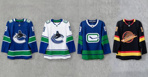
In preparation for their 49th season 50th anniversary, yesterday the Canucks unveiled four new uniforms that they’ll be wearing in 2019-20 and beyond. These jerseys include an updated home-and-away killer whale set (minus the ‘VANCOUVER’ wordmark), an alternate jersey featuring an updated “stick in rink” logo and a Flying Skate throwback sweater.
When it comes new Canucks uniforms, I’d consider myself part of the team’s key demographic; I generally only buy one new sweater every era, but I’m open to buying extras if they’re worth it. My collection isn’t at the level of some sports fanatics out there, but since Adidas took over as the NHL’s jersey supplier I’ve added one new uni each season; the Canucks’ first Climalite home jersey in 2017 and an Elias Pettersson All-Star sweater for my weekend in San Jose back in January.
So today I thought I’d take an in-depth look at each of the Canucks’ new jersey offerings and offer my critiques for each of them.
Home Jersey

Ah, the killer whale. This might come as a shock to any of you non-Vancouver fans reading this, but the killer whale logo might be the most split issue Canucks Nation has dealt with since the great Luongo/Schneider debate of 2013 (Which, by the way, the correct answer was always Lu).
I know I’m in the vocal minority here, but I actually like the killer whale. Being a 1997 baby, the orca is the only main Canucks logo I’ve ever known, and it’s far more synonymous with the team to me than any of the old ones. This franchise has always had a bit of an identity crisis, especially in the colour department, and seeing the team stick with the green and blue orca concept through a major rebrand was the right call to make.
The biggest improvement on these sweaters are the removal of the ‘VANCOUVER’ wordmark across the top. I didn’t hate the wordmark as much as some fans did, but the jersey does look a thousand times cleaner now that it’s gone. I also really love the updated white “stick in rink” logo on the shoulders. Putting them in a contrasting colour to the jersey makes them super eye-catching, and easily the best new feature on these sweaters.
Away Jersey

I’ve never been a huge fan of NHL road jerseys, but the Canucks have always had solid ones. The orca looks just a little bit better on the white jersey than the home blue, but for me some serious points were lost on the “stick in rink”.
When the home jersey leaked a few weeks back with the new white alternate logo on the shoulders, I assumed that the blue one would remain on the road uniforms for the same inverted colour effect. But the Canucks chose to get rid of it entirely, and I think that was a big mistake.
But I was never gonna buy one of these jerseys anyway; maybe someone who will wants to voice their input below?
Heritage Jersey

Now we get to the biggest part of the reveal; the new alternate sweater.
In a way, the Canucks managed to take a risk and play it safe all on the same jersey. The new “stick in rink” logo is front and centre, with no shoulder logos and a pair of large green stripes that’re a callback to the team’s original jersey from 1970-71. Where the team really made a change is in the lettering, with perforated dots on the numbers to represent the Vancouver rain.
For me, the jury’s still out on this one. While I love the bigger incorporation of green on the sweater, the large white collar around the neck looks like a ruff that a British lord or lady would wear to the theatre. I think a smaller stripe around the neckline would’ve been better, and keeping the white between the green pair would’ve made the uniform look more slick.
But as far as I’m concerned, this is a pretty solid entry into the relatively lackluster collection of Canucks’ alternate jerseys. This is one of the few times where the team has managed to properly mix past and present into a third jersey, and while it’s no “Gradient Orca” from the early 2000s I think it takes a close second place. The “We Are All Canucks” slogan on the back of the next is a nice touch, too. It’s also the jersey I’m probably gonna get first since I have enough orca jerseys to last a lifetime.
Throwback Jersey
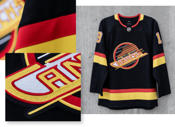
For those of you questioning my love of the orca over the Flying Skate, let me remind you that in my 21 years on this Earth I’ve seen the Canucks wear these jerseys only once; February 2016 against the pre-Auston Matthews Leafs. See why the nostalgia doesn’t work on me?
But even though I can’t put on the rose-coloured glasses that my older counterparts have, I can recognize a nice logo when I see it. And the Flying Skate logo is absolutely perfect. It looks especially beautiful in the Adidas template, and hopefully the Canucks get more than three games use of these uniforms before they disappear again.
I’m not gonna pretend I like the colours though. Red, yellow and black are a terrible colour scheme that only a Calgarian or Bostonian could enjoy. If the team decides to use the Flying Skate again sometime in the future, might I suggest an alternative?
No need to thank me, Canucks. The first jersey off the production line is all I need.
Closing Thoughts
Overall, I think the Canucks new set is nothing extraordinary, but does a great job of improving on the last set of sweaters and taking fans opinions into consideration with the wordmark removal and the Flying Skate reintroduction.
My biggest questions are in regards to the way the reveal was handled; I was expecting the team to wait and reveal them in front of the home crowd at the NHL Draft next weekend. Deciding to announce them just hours after the Blues win their first Stanley Cup seemed like a bizarre call.
I’m also curious as to why they didn’t use any current Canucks as part of the unveiling. Sure there were some former Canucks like Kirk McLean and even celebrities like Tyler Johnson involved in the press photos, but were none of Elias Pettersson, Brock Boeser and Bo Horvat available too? And where was my invite?
Nevertheless, the new uniforms are here, and I’m already looking forward to seeing them in action for the first time this September.
I can last three months without hockey, right?
Thanks for reading! What do you think of the Canucks new uniforms? Leave a comment below!
![]()
